Essentials to know when designing your online store banner
Ecommerce
229 week ago — 5 min read
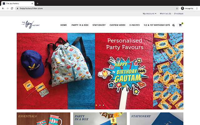
Banners are the visual elements in an ecommerce site and draw a great deal of attention. If executed well, banners can be visually appealing and can induce shoppers to buy more from your eCommerce store.
Banners are a valuable piece of real estate and can serve several purposes or business goals.
- Tell your story
Banners can help build your brand. This method can be particularly effective your business and products have a great story that can be depicted visually. Use banners for this method involves featuring key information that educate your visitors on your brand story.
- Highlight your USP
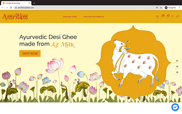
Perhaps the most important use of banners can be to explain your brand's value proposition. This explains exactly to your customers the value your product(s) deliver them. What better place to tell your customers your value proposition than on your homepage banners where the majority of visitors land.
- Feature products
Banners can be leveraged to showcase a product or a particular product line. This can be ideal for when you launch new products and want them to receive the most amount of attention, as well as featuring your hottest selling products.
- Announce a promotion or special offer
One of the most prominent uses of banners is to feature an announcement like a sale. This is a great place for sale notifications since it will reach the most number of visitors.
Also read: Want to make your ecommerce store go from good to great? – Here is how!
Here are 5 tips to create effective banners.
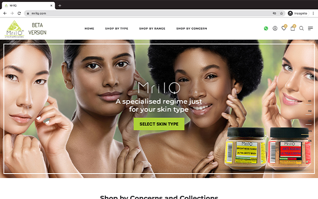
1. Use powerful images
Do not compromise on image quality when it comes to designing your banners. Pick images that are bright, full of colour, eye-catching and showcase your product well. Try to incorporate images of happy people shown using your product. Image should be cropped in a way that it looks good on all devices.
2. Employ good design principles
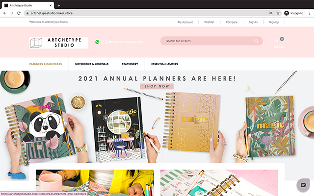
Good design is absolutely critical to positively influencing customers. Employing sound design principles will help you prioritise information and convey more in the limited amount of space available. You can make creative use of colour, typography, layouts, real-life images of people and product shots, use animated or other graphic elements. This will contribute to the creation of compelling design for your website banner.
3. Use engaging copy
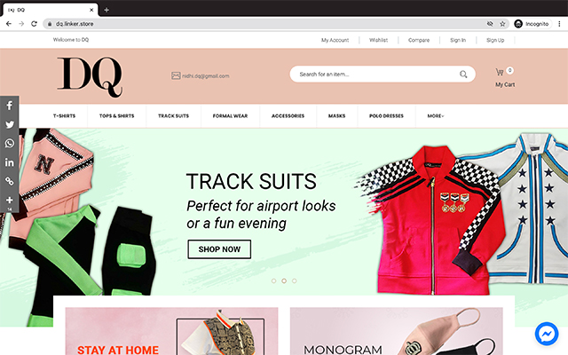
You may have to fit your entire brand story on a single banner. So writing clever copy that catches the attention of readers and conveys a lot of information with a few, well-chosen words are important! The 3Cs approach is recommended—focus on compelling, clear and concise messaging.
Use words that trigger clicks. Without resorting to clickbait, make sure that you use phrases that grab attention. Use strong, powerful action words and convey the urgency that will nudge the customer to click on the eCommerce banner image to take the intended action.
Also read: Power of content: How to generate traffic to your eStore using content
4. Experiment with colours
Colours play a vital role in evoking emotion and subconsciously influence action. People associate specific colour schemes with brands. The psychology behind the usage of colour offers some fascinating insights. Read more about how colours influence marketing decisions.
Also read: Design and market your way through customers' minds with these resources
5. Include a clear CTA
Lastly, ensure that your banner prominently features a clear call to action or CTA button. CTA buttons are very important to increase Click Through Rates. Place CTA buttons on the lower right side in a colour that complements the overall ad, but in a contrasting tone so it stands out as well as easy to see. Furthermore, a slightly dated study from 2017 found that optimising landing page CTA lead to a whopping 245% increase in leads.
Have more useful tips on ecommerce banner design? Share with us in the comments section below.
To explore business opportunities, link with me by clicking on the 'Connect' button on my eBiz Card.
Image source: shutterstock.com
Disclaimer: The views and opinions expressed in this article are those of the author and do not necessarily reflect the views, official policy or position of GlobalLinker
Posted by
Manav RastogiTo develop various marketing schemes and strategies for DigiVation and it's clients. Also serve as the project manager working directly with employers and be responsible for...
View Manav 's profile
Most read this week



Comments
Share this content
Please login or Register to join the discussion